


I’m strange in that the dashboard layout of a car can make or break how I feel about the whole vehicle. Once you plop down into the seat and get to moving, the gauges are looking at you, the controls are waiting for your inputs, and you can’t look away. It’s a part of a vehicle’s style that I truly pay attention to…I like clear and concise gauges, I like legibility, and I like a no-BS, here you go layout.
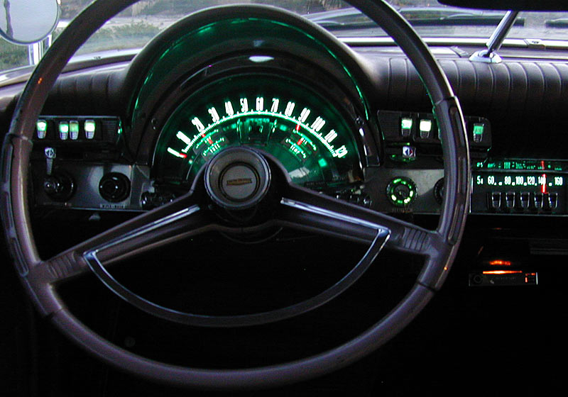
 The first car that I knew I liked the dash in was a Chrysler M-body. Clear, big dials, decent information. Since Chrysler was out of the performance game, full instrumentation was out of the question, but there was plenty of space available for the big six: Speedometer, tachometer, oil, volts, fuel, and temperature. In a police package M-body, you got five out of six. No tach, and the oil pressure gauge was an afterthought added in (lower-right in the small stack). The Chrysler green lighting is something else I love…when it works and doesn’t disappear at random times.
 Another design that works well in my eyes is the 1970-78 Camaro layout. Speedometer and tachometer up-front and in your face. Fuel, amps and temperature close by. Oil pressure was reduced to an idiot light that told you that there was none, but in all fairness, that clock in the southeast corner could be converted and then it’d be perfect.
Or you could go for the ultimate overkill in styling and enjoy something like the Chrysler “Astra-Dome” treatment like you’d see on an early-1960s big car. That’s my opinion, but we want to hear yours!


1968 to 1982 Corvette
’68/7’71 Mopar B body Rally and ’70/’74 E body Rally and ’66/’67 Chargers last but not least mid 50’s 300’s
one that you may not have seen – google it if you haven’t – XAGT or XBGT Falcon (Australian). Tacho on the left (some are 8 grand) , speedo on the right (140 MPH) in deep with 4 aux gauges above them, wraparound style with a clock etc. They look very purposeful, very easy to read and drive with.
I’m not a mopar fan, but the 62 Chrysler 300 has an awesome dash. I would also say 55 Ford cars.
Yes, I too prefer the second generation Camaro dashboard. The 79-81 is virtually the same but flush instead of angled.
’57 – ’58 ford.
Almost anything that was not built in the last 40 years. NO PLASTIC ON MY DASH PLEASE.The art deco of the late 40’s and into the 50’s. How about the first Olds Tornado. the speedo red line stayed still . And the numbers rolled past the line. How a bout 50’s T bird . The speedo was an eyebrow above the dash .And it was see through . You could lean down look at your speed and see the road in front of you. And all of the Mopars with the push button trans. The buttons for the trans was on the left of the dash. And the heater A.C. controls were on the right side . and they looked the same. Cars today have no character . it doesn’t matter if the car is a hundred grand or a 15 grand car. The dashes all look the same.Either grey or black with an eyebrow behind the wheel. No body color on the dash at all . Nope don’t like anything that is all plastic,and has no body color on it .I have never had a car with a metal dash that was all cracked up from the sun . A little cleaning and some fresh paint . And they look like new. No need for a $200.00 after market dash pad . There, that’s what I think is the best dash .
70-72 Chevelle SS, Monte Carlo dashes.
I agree with Mr. Reed. I have Studebaker disease, so the Larks, Hawks, Avantis, and especially, the M, R, and C cab trucks all ring true to me. Loved the dash in my 1963 Lark – simple, yet elegant, and very easy to read.