That’s what you are thinking, right? We thought so. Welcome to the new BangShift.com which is both very much the same and very much different than what you were used to seeing even just a few hours ago. This new site is the result of months of hard work between us and the guys at Route 2 Media.
Here’s the deal, this weekend is our kind of “soft opening”. We want you all to click buttons and try to break stuff. On Monday we’ll do our grand opening and tell you what all the new bells and whistles are about. This is a big deal for us and we’d love your help in telling us what is working and what isn’t working.
One thing we’ll tell you to do is to check out three new BangShift sub-sites. Again, more details coming Monday but here’s the basic gist:
The front page will always and forever remain the cool, weird, wild, historic, and diverse page of content it has always been!
BangShift1320 presented by Chris Alston’s Chassisworks = Drag racing and only drag racing all day all the time!
BangShift Apex presented by RideTech = The subsite for people who love ANYTHING that turns from pro touring to sprint cars!
BangShiftXL = Trucks of all shapes, sizes, and intentions plus stuff like tractors, truck racing, tractor pulling, and big weird stuff that Lohnes loves.


Guys –
Where’s BangShift LSR, brought to you by Speedway Motors (or whoever)? Clearly something’s missing.
Dan
Dan, the key is always leaving room to expand!
I like it guys, especially the break down of the drag, corners and trucks. Just glad you didn’t do it on the Fools Day, that would have tripped everyone up!!!
So updating the forums wasn’t enough sturm und drang? Now if you could just get the webserver to respond faster than … minutes… per click.
Hmmn .. Well .. So far .. I aint convinced this is ‘ better ‘ . So far … it feels like change for the sake of change . But being a semi reasonable sort of fellow [ about most things or until it becomes ‘ personal ‘ ] I’ll keep an open mind and see how it all pans out once the new format is finalized . Gotta tell you though I’m already missing the much clearer , cleaner , more negotiable and concise front page of old . Jus sayin ….
really like the effort–miss the simplicity of the old site–looking forward to getting use to the new look and finding out how to get around it–remember K.I.S.S. for us old guys (keep it simple, stupid)
Brian, the pictures look smooshed on my iPhone. It’s like it’s not resizing them correctly.
Yup here too
Black font on blue border is no good. Cannot read at all. otherwise digging it.
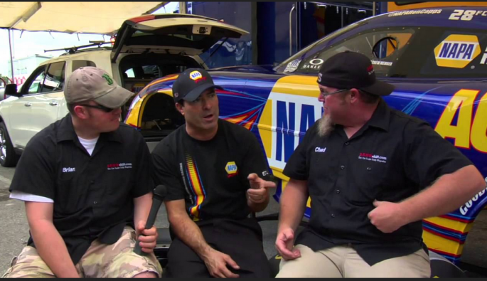
Other then Capps talking to weirdos, looks great. 🙂
Looks good. I like the new layout. The only thing I dont LOVE is the lack of a “next” button. Not that I can’t figure out that if I’m on page 1, I need to click “2” to get to the next page, but hey, I’m a lazy bastard.
Good call. That is something we can tweak.
The 1320 button at the top has a green rectangle that says: “View all APEX News” instead of “View All 1320 News”
🙂
Oh and it needs more red!
my page keeps jumping around (banner ad at top?)
I like the direction it’s going. If it were mine choice, I’d put the comments above the links to other articles as well as placing the share stuff at the top of the article. And as mentioned, the light blue and black font is glaring. BBR is right, needs more red =D
Hey, what do you mean on the light blue and black font? What blue are you seeing?
The Menu bar at the top with gallery and so forth. funny thing is on my home PC in Chrome it is fine. Could be the work machine as I am forced to use IE8 there.
Not bad, I kinda like it. But please, please, please fix the photo galleries. They’re still very broken, and possibly broken worse now. eg. “click on image to enlarge” results in a larger image that keeps flashing at you.
A couple other potential issues with the new site:
– the heading fonts render crappy in Opera.
– loading the site is pegging my CPU. Please get rid of some bloat in the code.
If i knew what i wanted to look at on the internet i would go look precisely just for that. Your website before u fu&$@d it up would let me look at stuff i had know idea i would like. Now i have to navigate to a bunch of different places. I dont have time for that. I wont be on your site 10 times a day anymore. Maybe once a week. I dont understand the format/layout its confusing and annoying . I generally avoid websites that look like this now.WTG
I know advertising is important, but the banner on the right needs to be smaller, so that the “Youtube” links are not partially covered.
Hard to get to the expand button w/o a lot of scrolling
I find the new format to be difficult to find things, really liked the old, simple BangShift, will keep trying to get comfortable with it, was comfortable with the old B.S. first time on it, sometimes more is not better (except horsepower). Good luck with this,
Looking forward to Monday Brian,try to keep thing simple,life’s complicated enough.
The ad on the right side of the page covers up part of the youtube videos. I know that ad’s are what make the site money, but it is frustrating when they interfere with the content that I came here for.
Ry, that is a fix we’re making now. It has to do with how we posted videos previously with our old system. Cleaning them up over the next day or two. Thanks!
Segregation …. wow
The front page will remain the giant wacko mix of everything but the additional sites let us run items that are more aimed right at people’s interests. For example, truck guys aren’t really going to care about autocross results so they’d be in Apex. Drag Racing guys may not really give a rip about some tech we do on a diesel truck, etc.
That was the beauty of the old BS, I could see a great of variety of things, and introductions to new, cool stuff.
so far–1 negative vote-just does not feel like BangShift-trying too hard to be too many things
Hate it most of us old guys that have been here for a long time still use PCs NOT tablets or phones that is style is designed for.
Life is change and sometimes not for the best. This looks like a newspaper and is very unappealing, but I will still continue to read it. Why mess with a good formula?? Yes, the divided categories are okay, but the font and lack of color isn’t. You could’ve split up the stories and left the rest alone!
I like the two column format of the main page. I was thinking it was time as there are often more blog posts in a day than fit on one page. Some of the sizing of stuff and some darkening of the overall page to reduce the blindingness of the page (the old colors and ratio’s were good!, make it familiar!). And as I noted, I think the comments really need to be immediately below the blog post, not separated by links to other articles and the share stuff. 90% of the time I’m against change, but I think this one is heading in a good direction.
In answer to your above comment Brian, the lazy ones might complain, but all they have to do is scroll past what they don’t want to read! I liked the old arrangement and often read stories I usually wouldn’t read.
BS has definitely become part of my life so I am for sure going to greet the change with optimism (from an old guy not great with change). I think I will like drag race split. Good luck guys.
Hey Brian where do we find the engines section at?
Sorry, but this new webiste version is horrific. Here I am, loaded it up in Chrome (because that’s the only browser I had that could open it) and it still looks like shit. You know poeple still use laptops & desktop computers to use “The Web”? It’s not all tablets and cellphones? And you know it’s possible to have your website talior it’s response to the detected “browser” type? No, this new version is hella awkward, and I really did enjoy this site before. I don’t see how you can make this work for me.
I would slow down and allow them to work out the bugs on the thing before throwing it all aside.
Weh you decide to change something, it’s always useful to ask/research what your audience likes or dislikes about your service. You’d like to engage them in the process and get them to “buy in” to it, before you make drastic (or any) changes. You don’t change everything overnight and then ask your audience to debug your “chosen (re)design” and fix-it for you. And you should find out a bit more about who constitutes your audience first. Maybe the previous site looked terrible on a cellphone. I don’t know, but when trying to fix that, why sacrifice what was a nicely laid-out and perfectly servicable “non-mobile device” website? I’m not impressed with this test/beta site either, because it hasn’t rendered itself in a sensible way in any browser I have (I have no mobile devices beyond a laptop).
I don’t think you guys have enough trackers on your new website. I counted only 8 via “Ghostery” and 36 via “Disconnect”.
I know you’re a business, and I don’t decry that, but was this site upgrade just to better monetize your most valuable resource, your audience?
Even though I don’t adapt to change very easily, I think it’ll be fine. Its a bit more difficult on a mobile device but many web sites fall into that category. That’s not a deal changer. Let’s all test drive this thing.
Also, a sign of a shitty web-design, the fact that if you narrow your browser window ( I never fullscreen a broaser), None of the News “menu” stories are clickable. The “Mouseover only” opening of menus is also a pure “tablet” design fuck-up. Those damn menus keep getting in the way when one does what one usually does with a mouse, which is move it around the screen. This site has clearly been redesigned for tablets, and probably only for apple product users. Don’t hire hipster web-designers…
It looks to me like y’all lust about doubled the content on the front page. Way to go.
IT BLOWS. Change it back.
When Lohnes makes a change “hang -on” most likely it will be Way Better & Way Kool!!!!!!!!!!!!!!
Good luck with the new site….. and if I may say
Congratulations to Brian Lohnes for finally making it to the Big Leagues, recognized as the New Voice behind the mic for NHRA!
Good Job!
Too much info on first page, like it better as 1.0 version. But like everything else in life, we get use to change.
Love it. Soul food for the attention-span challenged.
if this is it, no more complaining, constructive only, will learn to appreciate it, seems to react really slowly, plus I am not a spambot!!!
maybe put comments above related items
… what a buggy pos site, it causes my CPU to peg about every 30s.